Creating A Custom Slider in SwiftUI
In my current work as an iOS developer I have found it kind of hard to customize SwiftUI Sliders in a convenient way. So as it is relatively easy to implemen...

In my current work as an iOS developer I have found it kind of hard to customize SwiftUI Sliders in a convenient way. So as it is relatively easy to implement a new control in SwiftUI, I have decided to give it a shot. ( You can download the source code for the project Here ) My process for this project was the following:
Let’s grab a coffe and get to work!
I have started with the basic shapes.
So lets’s Create an Xcode project, choose SwiftUI, and create a new file - choose SwiftUI View from the templates, or just create a sift file.
I knew I want to use a capsule for the slider, so the edges are rounded, otherwise I needed a straight line for the scale.
So here is my struct.
struct CustomSlider: View {
    var body: some View {
        Capsule()
    }
}
That of course looks pretty weird, because it needs some frame. Embed the view in a GeometryReader and set the frame as the following:
 GeometryReader { reader in
            Capsule()
                .frame(width: reader.size.width, height: 2)
        }
Next up, I want to add the handle. I will use a Circle() shape for this.
Let’s embed our view in a ZStack, and add the Circle as the following:
GeometryReader { reader in
ZStack {
Capsule()
.frame(width: reader.size.width, height: 2)
Circle()
.frame(width: 10)
.foregroundStyle(.white)
}
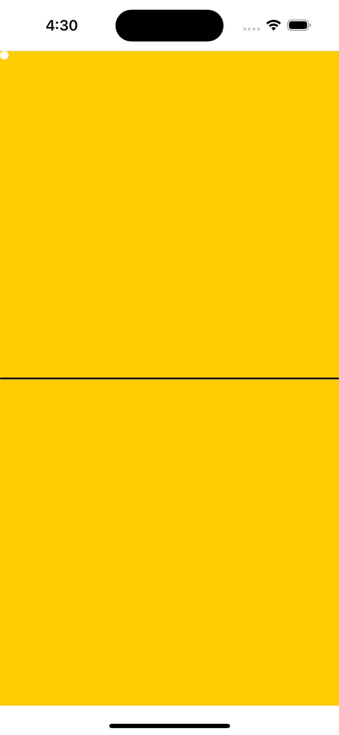
}Note that the handle’s foreground color is white, and it is not quite visible on the white background. When you are looking at it on previews. So in PreViews (at the end of your file) embed the whole thing in a ZStack and add Color.yellow above it, or a color of your choice. If you do not have previews because started with a pure Swift file, add it now.
In Xcode 15 and above it looks like this:
#Preview {
    ZStack {
        Color.yellow
        CustomSlider()
    }
}
Now, I want to get that slider to the middle, so lets wrap it into a Geometry reader as well passing the closure parameter as r.
Now the only problem is that our handle is not at the right place.
Let’s fix this by adding a position modifier to the circle:
.position(CGPoint(x: r.size.width/2 , y: r.size.height/2 ))Now, that our handle is in the right position - at least on the slider -, it is time to implement the drag gesture.
The simplest method to add a drag gesture is to add a
@Gesturestate variable and updating it from the .updating(_:) function. However this will not do in our case, as we need to handle the phase when we released the handle, to keep our handle on the new position.
Thus, we need to implement a DragGesture with both the
.onChanged() and
.onEnded() functions.
Let’s do that now!
So, how we want to position our handle?
We need to get the value’s translation from the drag gesture, and we also need to know how that relates to the slider’s legth.
But first of all we do not want to hard code the position of the handle of course.
So let’s move that CGPoint value we have in our position modifier to a @State variable in our struct and set it’s x and y values to zero.
Then substitute this variable in the position modifier.
Next we want tu update the position of the handle, when it appears. We can do this by adding an onAppear() function after the ZStack, and update the x and y values from the reader size values.
Next we need to add code to our onChanged function for respond to drag gestures.
Let’s try something naive:
struct CustomSlider: View {

    @State private var position = CGPoint(x: 0.0, y: 0.0)
    var body: some View {

        GeometryReader { reader in
            ZStack {
                Capsule()
                    .frame(width: reader.size.width, height: 2)

                GeometryReader { r in
                    Circle()
                        .frame(width: 10)
                        .foregroundStyle(.white)
                        .position(position)
                        .gesture(
                            DragGesture()
                                .onChanged({ value in
                                    self.position.x = self.position.x + value.translation.width
                                })
                                .onEnded({ value in

                                })
                        )
                }
            }
            .onAppear {
                position = CGPoint(x: reader.size.width/2, y: reader.size.height/2)
            }
        }
    }
}
The problem is that when we drag the handle it starts moving, but then leaves the screen. Dissappears to the infinite space.
Of course, we need to implement .onEnded()!
Let’s do that!
But how to use these values? Let’s try something stupid!
Let’s add this code:
 .onEnded({ value in
      self.position.x = value.translation.width
    })
What happens now, is that every time I drag the handle, the drag distance with practically bacomes the position x value - the wider the drag gesture is, the further the handle gets from the leading edge. We should somehow store the handle’s position to solve this issue. We want to calculate the position relative to the last position of the handle. Lets add a new state variable, called lastPosition, and set it to an optional CGPoint. Then work woth this variable to calculate the handle’s new position:
struct CustomSlider: View {

    @State private var position = CGPoint(x: 0.0, y: 0.0)
    // Add new variable: lastPosition
    @State private var lastPosition: CGPoint?
    var body: some View {

        GeometryReader { reader in
            ZStack {
                Capsule()
                    .frame(width: reader.size.width, height: 2)

                GeometryReader { r in
                    Circle()
                        .frame(width: 10)
                        .foregroundStyle(.white)
                        .position(position)
                        .gesture(
                            DragGesture()
                                .onChanged({ value in
                                    // set the position of the handle relative to it's last position, based on
                                    // the change of drag value on the x axis
                                    position.x = lastPosition!.x + value.translation.width

                                })
                                .onEnded({ value in
                                    // set the lastPosition variable, to the current position to keep track of it
                                    lastPosition?.x = position.x
                                })
                        )
                }
            }
            .onAppear {
                // 1. putting the handle position in the middle at start
                position = CGPoint(x: reader.size.width/2, y: reader.size.height/2)
                // 2. seting the last position same as the initial position
                lastPosition = position
            }
        }
    }
}
Now we have a slider with a draggable handle.
Our slider is not doing too much at the moment, so let’s give it a value. A slider always should have an initial value and a range. But for now let’s just build in the simplest steps.
Add a @State variable called sliderValue, And set it to a Double value of 0.0.
For now we’re gonna calculate a value between 0.0 and 1.0, so we add the following code after calculating the position.x in .onChanged():
   sliderValue = position.x / r.size.width
   print("slider Value: \(sliderValue)")
Add the slider to your ContentView and run the app. Drag the slider, and observe the values printed on the console.
We calculated the slider value by dividing the position by the slider widht. It will be 1.0 when the slider is fully on, and 0.0, when set entirely to the left side.
Now that you are updating the slider value, change your @State variable to @Binding and remove the initial value. Note, that you’ll have to update the Slider in xou preview too, by passing .constant(0.5) as for thenew sliderValue parameter. You won’t be able to use the slider in the preview anymore, since the binding you passed is a constant, but that is how bindings in previews work.
Youll have to add that parameter in the ContentView where you are calling the Slider. Create a @State variable called sliderValue in ContentView, and pass it to the slider as $sliderValue. The dollar sign means, that this is a binding value - this will be the initial value of the slider, and also this will be the variable the slider is going to write to.
Now that we have working slider, add some improvements before we start cusomizing it.
We would like to see better, how much the slider is on or off, by adding an on tint color. Let’s add the following modifier to the slider’ first Capsule:
.overlay { // overlay will match the frame heigth and origin of the parent
            Capsule()
                .frame(width: position.x )
                .frame(maxWidth: reader.size.width, alignment: .leading)
                .foregroundStyle(Color.blue) // on tint color

                    }
The off tint color is basically the original color of the slider for now. But this is what wer’re about to change in the next chapter.
We want to add initializers for all the parameters we wnt to make cusomizable. We want to add onTintColor, offTintColor, handleSize, handleColor parameters for greater flexibility. As this is already four parameters, let’s wrap it into a configuration object.
extension CustomSlider {
    struct Configuration {
        var onTintColor: Color = .blue
        var offTintColor: Color = .black
        var handleSize: CGFloat = 10
        var handleColor: Color = .white
    }
}
As all parameters are initialized to a default value, we can initialize this config struct without passing any parameters.
And we’re going to do the same with our Slider for now. Add this initializer:
struct CustomSlider: View {


    @Binding var sliderValue: Double
    let configuration: Configuration

    @State private var position = CGPoint(x: 0.0, y: 0.0)
    @State private var lastPosition: CGPoint?

    init(sliderValue: Binding<Double>, configuration: Configuration = Configuration()) {
        _sliderValue = sliderValue
        self.configuration = configuration
    }
    // rest of code omitted
}
…then we just use the variables on the view:
 var body: some View {

        GeometryReader { reader in
            ZStack {
                Capsule()
                    .frame(width: reader.size.width, height: 2)
                    .foregroundStyle(configuration.offTintColor) // off tint color
                    .overlay {
                        Capsule()
                            .frame(width: position.x )
                            .frame(maxWidth: reader.size.width, alignment: .leading)
                            .foregroundStyle(configuration.onTintColor) // on tint color

                    }

                GeometryReader { r in
                    Circle()
                        .frame(width: configuration.handleSize) // handle size
                        .foregroundStyle(configuration.handleColor) // handle color
                        .position(position)
                        // rest of code omitted...
And now the trickiest part - add a range parameter, and use its lowerBound and upperBound parameters and all the values in between for the slider value.
Add and initialize the range variable in init, and perform the changes needed to silence the compiler errors.
First thing we need is the scale length of the slider with the new range parameter. We calculate this the following way:
extension CustomSlider {
    private var scalelength: CGFloat {
        range.upperBound - range.lowerBound
    }
}
Then we calculate the initial handle position.
If you think of it, the position will be the frame width mulitplied by the ratio of the slider value and the scale length. Well, not exactly! Only if we assume, that the range’s lower bound will always be 0. But it can be any positive number lower than the upper bound(!), and it can be a negative number as well. So yes, we have to extract the lower bound from the slider value!
Add the following code to onAppear {}
   position = CGPoint(
                    x: reader.size.width * (sliderValue - range.lowerBound) / scalelength ,
                    y: reader.size.height/2)
                lastPosition = position
Now we have set the initial handle position correctly!
Let’s update the sliderValue according to the drag. (We are still printing out values roughly between 0.0 and 1.0, no matter what the actual range and position of the slider is)
We need to implement that in .onChanged() and .onEnded() of the drag gesture.
First we need to introduce a new @State variable called lastSliderValue (in analogy with the lastPosition) to keep track of the current values. So let’s put that in the struct, and initialize it with Double 0.0. Scrap the code in .onChanded(). Replace it with:
      .onChanged({ value in
             // 1. we are calculating the new slider value based on the last value and the
             // ratio of drag distance and scale length
            let calcValue = lastSliderValue + value.translation.width / scalelength
                                    sliderValue = calcValue
                                    // We calculate the new position
                                    self.position.x = reader.size.width * (sliderValue - range.lowerBound)
                                })
Also update the last slider value in onEnded:
        .onEnded({ value in
             lastPosition.x = self.position!.x
             // update last slider value
            lastSliderValue = sliderValue
            })
We also have to update the lasSliderValue with sliderValue in onAppear, to have correct values!
Run the app now!
Fail!
As you see it doesn’t seem to work just right!
The handle runs offscreen and we got a purple warning, saying ‘Invalid frame dimension (negative or non-finite)’ at the handle’s position midifier.
We have to reverse our thinking.
Before we were getting the handle positions from the slider value - we used a calculation in the onAppear function. We have to grab that calculation as an equation, and rearrange it to get the slider value on the right side instead of the position.
So let’s set the minimum and maximum positions correctly in onChanged!
let minPosition = min(lastPosition.x + value.translation.width, r.size.width)
let maxPosition = max(minPosition, r.frame(in: .local).origin.x)
position?.x = maxPosition
// you get the slider value by rearranging
// the equation invented in the onappear function
// caclulating the position from slider value
sliderValue = (position!.x * scalelength) / r.size.width + range.lowerBound
That’ pretty much it. The complete source code is available here!
//
//  CustomSlider.swift
//  CustomSlider
//
//  Created by Gergely Kovacs on 2023. 10. 31..
//
import SwiftUI


struct CustomSlider: View {

let range: Range<Double>
@Binding var sliderValue: Double
let configuration: Configuration

@State private var position = CGPoint(x: 0.0, y: 0.0)
@State private var lastPosition: CGPoint?
@State private var lastSliderValue: Double = 0.0

init(range: Range<Double>,
 sliderValue: Binding<Double>,
  configuration: Configuration = Configuration()) {
        self.range = range
        _sliderValue = sliderValue
        self.configuration = configuration
    }

var body: some View {
        GeometryReader { reader in
            ZStack {
                Capsule()
                    .frame(width: reader.size.width, height: 2)
                    .foregroundStyle(configuration.offTintColor)
                    .overlay {
                        Capsule()
                            .frame(width: position.x)
                            .frame(maxWidth: reader.size.width, alignment: .leading)
                            .foregroundStyle(configuration.onTintColor)
                        }

                GeometryReader { r in
                    Circle()
                        .frame(width: configuration.handleSize)
                        .foregroundStyle(configuration.handleColor)
                        .position(position)
                        .gesture(
                    DragGesture()
                            .onChanged({ value in
                                let minPosition = min(lastPosition!.x + value.translation.width, r.size.width)
                                let maxPosition = max(minPosition, r.frame(in: .local).origin.x)

                                position.x = maxPosition

                                sliderValue = (position.x * scalelength) / r.size.width + range.lowerBound
                                })
                            .onEnded({ value in
                                lastPosition?.x = position.x
                                lastSliderValue = sliderValue
                                })
                        )
                        .onAppear {
                            position = CGPoint(
                                x: r.size.width * (sliderValue - range.lowerBound) / scalelength ,
                                y: r.size.height/2)
                            lastPosition = position
                            lastSliderValue = sliderValue
                        }
                }
            }
        }
    }
}

extension CustomSlider {
struct Configuration {
var onTintColor: Color = .blue
var offTintColor: Color = .black
var handleSize: CGFloat = 10
var handleColor: Color = .white
    }
}

// MARK: Helpers
extension CustomSlider {
private var scalelength: CGFloat {
        range.upperBound - range.lowerBound
    }
}

#Preview {
    ZStack {
        Color.yellow
CustomSlider(range: -1.0..<1.0, sliderValue: .constant(0.5))
    }
}
Happy Coding!
In my current work as an iOS developer I have found it kind of hard to customize SwiftUI Sliders in a convenient way. So as it is relatively easy to implemen...
In the first wave of the covid-19 pandemic I came across a site called DataCamp. They offered a huge discount on online data science courses mainly focusing ...
Finally I have decided to make a website for myself. I started this project mainly due to my love of learning new technologies. I started coding as a hobby ...